How to Incorporate Bold Colors into Your Home Design
Alright, bold colors. They’re not for the faint of heart, but if you’re anything like me, they’re like that risky outfit you debated wearing—until you did, and suddenly, you’re unstoppable. The thing about bold hues in your home? They’re not just a decoration. They’re a statement. They scream personality, energy, and vibes.
But, let’s be real: it’s not as easy as slapping neon green on every wall and calling it “artistic.” You’ve got to do it right. So, let me tell you how to incorporate bold colors into your home design without making it feel like a circus.
Why Bold Colors Matter (And Why You Should Care)
Look, here’s the deal: when it comes to how to incorporate bold colors into your home design, we’re not just talking about slapping a coat of crimson on your living room wall and hoping for the best. Nope, it’s deeper than that. Bold colors can transform a space—it can energize a room, calm your nerves, or even make you feel like you’re living in a Pinterest board.
Color Psychology: Yep, It’s a Thing
You don’t just throw a color on a wall because it’s pretty (well, you can, but… let’s avoid the disasters). No, colors speak to us on a psychological level. They can influence our moods—just like how that one song you keep playing can make you feel like you’re starring in a movie montage.
- Red? Makes you feel pumped, like you just ate five burritos and have 200% more energy.
- Blue? Instant calm. Like standing in front of a vast ocean while pretending to be philosophical.
- Yellow? Instant joy, like the smell of fresh bread baking at a bakery at 6 AM.
I swear, when I painted my kitchen mustard yellow, it went from “meh” to “YES!” in a heartbeat. But, let’s talk about the how, because that’s where it gets tricky.
Start Small, Because You Don’t Want to End Up in Overwhelming Hues Territory
I get it. You’re not sure if a whole teal wall is the vibe. And honestly, who am I to judge? My first attempt at bold colors ended in me looking like a child with a crayon box—and not in a good way.
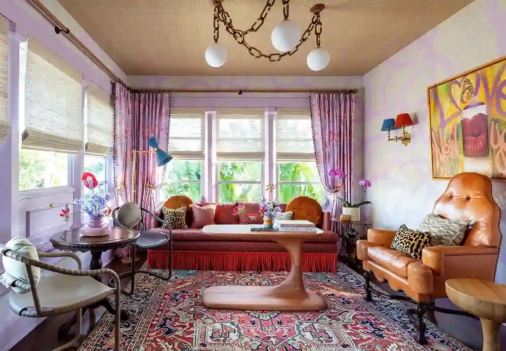
Accent Pieces: The Sneaky Intro
Listen, baby steps. Don’t dive headfirst into the color pool. Start with little pops:
- Throw pillows in electric blue or deep plum.
- A funky patterned rug (hello, emerald green!).
- A hella bright vase or lamp—just one, though. Let’s not get crazy.
These accents are like testing out an outfit in the fitting room before you commit. One bold piece, and you’ll start figuring out how to incorporate bold colors into your home design without it looking like a paint explosion.
Picking the Right Palette (Spoiler Alert: It’s Not As Hard As You Think)
So, now you’re thinking: Okay, I’ll try something bold. But… what’s the game plan?
Pick a Hero Color (and a Sidekick)
Here’s how you can mix it up without the room looking like a technicolor nightmare:
- Primary Color: Choose one bold color to be the leader. Maybe a rich emerald green or a juicy coral.
- Secondary Color: Pick something that’ll vibe with your main choice. Maybe a soft mustard or a dusty blue.
- Neutrals: Y’all, you need these. I love bright colors, but they need to be grounded. Neutral walls or furniture let your bold pieces take the spotlight.
Fun fact: I tried mixing a chartreuse couch with lime-green walls once. It lasted… maybe 24 hours before I hit “undo” and painted over it. Don’t be me. Stick to a plan.
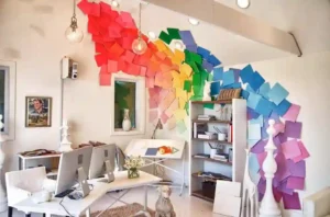
Bold Walls: Scary? Nah.
You might be like, “Should I really paint my walls an intense color?” Spoiler: yes, yes you should.
Go Big, Or Go… Okay, Maybe Not Too Big
- Accent Wall: Paint just one wall (maybe behind your couch?) in a rich, deep shade like navy blue or ruby red.
- Full Wall: If you’re feeling spicy, do the whole room. But think strategically. A dramatic color like forest green can make a small room feel like a cozy retreat.
- Half-Painted Walls: Not quite ready to commit to an entire color block? Go halfway—half-paint the wall with your bold color and leave the top neutral.
I did this once in my bathroom, painted one wall in a fiery red, and let me tell you—when the light hit it, it was like walking into a glamorous 1950s movie set. Totally worth it. Also, the bathroom smelled like paint for a solid two weeks. Ah, the memories.
Ceiling? Yeah, Let’s Do It.
This is a trick I wish I had known sooner. The ceiling is basically the fifth wall in any room. Use it.
Try This: Color Above You
- Soft pastel ceilings can make a room feel breezy, like a lazy Sunday afternoon.
- A moody, dark ceiling (charcoal gray or midnight blue) can make your space feel intimate and mysterious.
So, I went for a dreamy sky blue in my living room ceiling. It did remind me of the day I accidentally painted myself into a corner with a roller, but it looked so dreamy I couldn’t complain. Anyway, ceiling goals.
Don’t Overdo It—Balance Is Key
Alright, here’s the kicker: how to incorporate bold colors into your home design successfully is all about balance. I learned this the hard way. You don’t want your room looking like a toddler’s crayon box exploded.
Tips to Keep it Cool
- Keep your bold pieces in line: One statement wall or one statement piece of furniture. The rest? Keep it chill.
- Use neutrals to balance things out: I promise, white walls are not the enemy. Use them to let your bold colors pop.
- Mix in textures to add depth—velvet, wood, metal… oh my.
I once threw a bunch of random colorful pillows together. Didn’t work. It was like a candy store exploded on my couch. Never again.
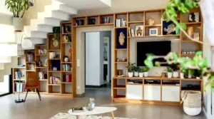
Think About Your Floors and Furniture
Don’t forget, the floor and furniture are prime candidates for color, too. I mean, if you’re already going for bold colors, why not go all-in?
Color Everywhere!
- Rugs: A wild rug in mustard or aubergine can totally transform the vibe of a room.
- Furniture: Have you seen those bright orange armchairs? Yeah, they can be a bold statement, but paired with neutral walls? Chef’s kiss.
My current obsession? A hot pink armchair I found at a thrift store on 3rd Street. It’s like sitting in a tiny, comfy, bubblegum-colored cloud. Highly recommend.
Art + Color: A Match Made in Heaven
If you’re still feeling hesitant, art is your best friend. It’s a low-stakes way to test how a color works without committing to it forever.
Art That Packs a Punch
- Big, bold prints in a rich mustard or teal can create huge focal points in your living room.
- Smaller pieces can be layered for more subtle, yet still bold, vibes.
I hung a huge abstract painting of a sunset above my dining table, and y’all, that thing’s been a conversation starter since. I’m convinced the person who sold it to me knew I’d regret not buying it—and I did.
Don’t Forget the Outdoors
Why should indoor spaces have all the fun? Your patio, balcony, or front porch deserves bold colors too.
Outdoor Boldness
- A bright turquoise door? Heck yeah.
- Colorful garden furniture in bold oranges and purples? You bet.
Trust me, your guests will talk about your front door for years. And it’ll be awesome.
Mistakes? Oh, I’ve Made Plenty
Alright, let’s be honest. There have been mistakes along the way. We’ve all had those “what was I thinking?” moments.
Common Pitfalls
- Overdoing it: Too many colors is like trying to juggle flamingos—cool at first, then it’s a mess.
- Forgetting the light: The way your color looks in the store versus how it looks in your living room? Different ballgame.
Anyway, I’ve had my share of paint disasters, but it’s all part of the fun, right?
Final Thoughts (If I Can Even Call Them That)
So here’s the thing. How to incorporate bold colors into your home design is a journey. And like any journey, it’s not always smooth sailing. But when you get it right? It feels like you’re living in your very own colorful masterpiece. Just remember to have fun with it, be bold, and if it goes wrong, hey, you can always paint over it. No biggie.